Launching a website or blog is fairly straightforward. You build the content, publish it, and then tell everyone about it. That’s about it–right?
Not quite!

I can’t just send an email that says “Hey, I have a new website. Please check it out at http://artbizcoach.com!” There’s no incentive. Nothing to get you to click the link and visit the site.
I have to entice you or pique your curiosity. I think the new look of the newsletter I sent today is a good first step, but let me see if I can do more.
After more than 3.5 years of a deep red background on Art Biz Coach, I had had enough. Do you know how many images and font colors don’t look good with red? Add blue and yellow and it ends up looking like a kid’s playroom. (See the red background and the many changes in Art Biz Coach throughout the years.)
I want Art Biz Coach to be classy and professional. I want you to feel like you’re walking into a space made for art and artists.
I couldn’t do that with a red background or with my previous logo.
What you’ll find on the new Art Biz Coach is a lot of space and toned-down palette. But I think you’ll see it’s more colorful and more vibrant without the weight of the red background.

Matisse said art should be “something like a good armchair in which to rest from physical fatigue.”
I hope Art Biz Coach and Art Biz Blog become comfortable armchairs for you, and that they’re places you want to hang out. I hope you’re proud to be associated with them.
So, please, visit Art Biz Success and explore what’s available for you. If you find something that doesn’t work, send me an email with the URL of the offending error. I’ll be eternally grateful for your troubles and your understanding of my imperfect website launch.
Are you subscribed? You can still get this month’s gift, Rock Your Art Career: 23 Actions for Big Progress, by subscribing now.


50 thoughts on “How to Launch a New Website or Blog”
Thank you for all of the wonderful info Alyson! I’ve learned so much from you!! 🙂
Thanks, Linda! I appreciate your being here.
Beautiful new look on your website and newsletter Alyson! And thank you for the free Rock Your Art Career Actions.
Thank you, Kathleen! I hope you can put that document to work for you.
I love the new look of your website, Alyson. VERY contemporary! It also integrates really well with your blog format. I really appreciate that you offer the subscriber freebies. Your blog has been a great resource, and I’m sure it will continue to be.
One small note: Though I guess there’s not much you can do to avoid this: When I have your site up in my tabs, the abbreviated title for the page shows up as “Art Business Resources and Cons” (Consulting is cropped off at just the wrong place!).
Robin: That would be a big OOPS. How funny! You just need more tabs open so that it crops after Resources. 🙂
Alyson,
Your new website is very clean, toned down and readable. Nice work!
Thank you for all of your fantastic art business insights over the years.
-Cynthia Mosser
Thanks so much, Cynthia. I truly appreciate your taking the time to look it over.
I just love the new site, Alyson. So clean and sharp and I find it easier to navigate too.
Thank you so much, Kirsty.
The new site is fabulous Alyson…very easy to get around, and it has a really nice look and feel about it.
Great job and thanks for the free PDF !
Thanks, Alison. I’m glad it was easy and comfortable.
I’m taking your advice to heart, Alyson, and commenting on how great your new blog and website redesign looks! Thanks so much for your generosity as well as all the practical information you continuously provide. I’m going to keep clicking around the new site now…
Thank you, Deborah. I am so lucky to do what I do.
Oooh la la, Alyson!!!
The old red was big and bold and really grabbed your attention, which served its purpose well. I can see how other colors would not play well with it though. I like the grown-up version of this website better – makes you want to get a book (yes, yours!), get cozy and stay awhile.
Thank you for the bonus article, by the way!
I see you streamlined your classes too. Are there new ones in the future?
Krista: Thanks for recognizing the “grown-up” aspect. I hadn’t thought of it that way, but that’s how it feels.
Looks great, Alyson! I love the new banner image of you… fun and subtle and welcoming. It’s easier to navigate, has a great feel. (And thanks for the launch gift, too!)
Thanks so much, Sherrie! I got 3 emails immediately from people who didn’t like the banner. But I’m okay with that. I have to realize (dang, it’s a hard lesson) that I’ll never please everyone.
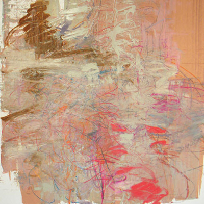
Hey, I totally love the choice of John Wood’s work for this big splash opening party…(is he going to be a Cy Twombly? one of my faves…) Nice choice…& how about Matisse! I love the armchair analogy…me too…now that the red is gone, I realise how much more relaxed I feel…I had no idea how excitable the red was as a colour, but now I feel much more peaceful here…a good ‘evolution’ though because I don’t buy into subtlety unless someone has already paid their marketing dues…which I think your workhorse attitude has proven you earned…The new website is fabulous, my first thought was ‘ I have to go over what you did with a fine tooth comb & copy everything…’ my bad…Should I send royalty money or something if I incorporate your “new subtle” into my hodgepodge websites? my love & congrats. , Sari p.s. the trees or vertical somethings with the repeating free flowing wind in the hair pics work for me too… p.p.s. you really impress me quite often…
That’s so nice, Sari! I really appreciate your kind words. The story of the “trees” (bungee cords) is on my About page–about half-way down:
http://artbizcoach.com/about
Hi Alyson
I’m lovin’ the new look…a lot. The banner is fabo.
The whole site is clear and yes, very much has the armchair feel…
I’m so dang busy with the ‘Go Get Organized’ class that I’ll have to come back tomorrow to really tool around.
I love seeing my kayak floating about on the page…that was such a fun day. Thanks for posting it!!!
And a huge thanks, Alyson, for your generosity of spirit and knowledge…I’ve learned such practical and clear information from your classes and other web presence. All that you share is so deeply appreciated.
Iona
Thanks, Iona! I am so grateful to have that photo. It’s super cool!
Wow! ‘Love the new site! Very easy to navigate, but like the “old” site, full of great info.
Thanks, Cappi!
Alyson, I am so impressed with your ‘makeover’…As Krista said – it’s looking and feeling very ‘Grown Up’. And I love the banner! The whole thing is very fresh clean and appealing. Great job!
Having taken much advice from you through classes over a few years, it’s kind of fun (I can’t decide if the right word is encouraging, or reassuring, or comforting…) watching you put your own advice into practice, and reminding us all that we need to continue to evolve over time. Or ‘grow up’, as it were!
Thanks too, for the freebie!
Tracey: Oh, thanks so much. I’m glad to hear that you think I’m going the right direction.
The new look of the website and the blog is really nice. And thank you for the gift. I have to start reading and doing what you reminded me to do.
Thanks, Lena!
Your launch was so good I immediately signed up for the newsletter.
I am now trying to think up free gifts ideas I could offer people that sign up to my site.
Karen: Yay! Thanks for being a new subscriber.
Cool as a breeze! The use of Iona’s kayak pic is inspired! Well done and I hope it brings you the zillions of wonderful visitors that you undoubtedly deserve 🙂 Thanks so much for the freebie as well – succinct, punchy and motivating!
BTW, I’m still with the plan 😉
Thanks so much, Wild C. I know you have good taste. 😉
Alyson, your about page Rocks Rocks Rocks!
Mentor by example, you are!
I like the shift in general on your page. It was feeling crowded and cluttered when I visited the old one. This one is a fine house clearing.
I appreciate the story about your home banner image. Visually, I am not yet thrilled with the grayness of it. But let’s see if it works for you as a logo. That’s what counts. I enjoy the other banners on other pages.
And look forward to being more engaged!
DC
Carla: As someone who teaches a Get Organized class, the last thing I want you to feel is “crowded and cluttered.” But it was. Do you really think it’s that gray? There are lots of colored photos and graphics.
I like the new look.
I really like the new look, Alyson! The clean, modern style is very inviting. I especially like seeing photos of you used as headers. Thank you for the gift.
Thanks, Lisa and Jennifer!
The new site looks great Alyson, very clean yet still a creative feel. You are always inspiring us to keep on top of our public face. Thanks.
Also, is that a Soto sculpture in the photograph of you on the header?
Julia: Thank you! The photo is me in a Rehberger sculpture. The story is about halfway down on this page:
http://www.artbizcoach.com/about/index.html
Nice new look, Alyson, yet it still feels familiar so I wouldn’t wonder if I was in the wrong place.
One little bug I keep seeing everywhere is your graphic for subscribing to your newsletter is chopped off at the bottom so I can’t completely see the letters in “products and ideas” or “weekly.” I’m guessing this isn’t on purpose…
Thanks again for all you do – I always give you as a resource when I meet new artists trying to learn more about the business of art.
Thanks, Judith. That bug should be fixed now. I called in the big guns to help.
Changing the look of your website was an excellent move! It looks more sophisticated and is easier to read…less “in your face” than before but compelling.
Thank you, Karen! I appreciate it. Sounds like it’s comfy for you.
Really nice reinvention of the site, Alyson. It’s still you, but even better than before!
Pingback: Bloopio – Crash Course « HC Consulting Group
Alyson,
I like your new look very much, especially your new banner. While your face is there you are in the background, just like a good coach who works in the background to help strengthen others. Great job.
I liked the red but I like this even better with its sophisticated colors and design.
Thanks for the freebies. I read them all and use those which apply… and most do!
Alyson,
Great new look! Although I am a big fan of “Red” this cleaner look really works, great job. I love all of the info you make available to us, thanks for all you do!
I love the new theme! Could you tell me if you are still using Thesis? It such looks contemporary and slick!
Thank you for providing such a wonderful source of information. I’ve been trying to sell art online for a couple of years and recently started a blog. You provide so much help!! Thank you.
Pingback: tortagialla.com – Artist and Designer Linda Tieu