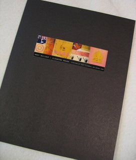
Deanna Wood shares a sneak peek at her well-designed, extremely professional presentation folders–with their contents–for two upcoming/proposed exhibits. Take a look:
- Waxy Buildup (which also has its own Waxy Buildup blog!)
- Beyond the Scrapbook
Image (c) Deanna Wood.


3 thoughts on “What do your presentation folders look like?”
Dear Alyson, This was very helpful! I’m currently making a transition from doing mainly tent shows to being represented by galleries and doing workshops. This requires a very different approach and the materials shown in this blog by Deanna Wood was a nice snap shot of a professional presentation. The last time I needed a portfolio was years ago as a graphic designer ( pre-computers!). Becoming a painter had a whole different entry point for me,but Deanna’s presentation made me stop and consider putting together a new presentation. Thanks! Helen http://pineshorestudio.blogspot.com
This presentation definitely raises the bar for beautiful presentation. I am happy that Deanna has shared this with us, and Alyson for bringing it out.
I saw Deanna’s beatuiful presentation when she first put it up and was very impressed. I have a similar folder with samples, etc. that I send out to designers for my tile business but it’s packed away somewhere. This entry reminds me to find it. In the meantime I have just put up some photos on my blog of brochures I’ve used in my business since it began in 1979. Just click on my name below and it should take you to the link. I feel like I’m coming out of summer hibernation though working almost 20 hours a day probably doesn’t really qualify as hibernating….