Your emails, blog and website have the potential to engage readers or turn them off.
How can you design your content so that people keep reading and look forward to hearing from you?

You’re creating a composition not only with your art, but also with words and design elements.
It’s an empty wall on which you showcase your work. Let me emphasize that: The focus should be on your art, not on a decorative font, logo, or the colors you choose.
Every decision you make when creating online content should be about elevating the art.
Having said that, you can elevate the art and retain readers’ interest with these tips.
Images Make An Impact
You are so lucky. You sell something that is visually interesting to look at. This is a big plus in today’s world of online marketing because images have become paramount.
Exploit this advantage!

Use big, beautiful images of your art in your emails, blog posts, and Web pages. Notice I used the word “big.” Tiny images rarely make an impact or encourage interest.
Take up at least 75% of the width of your column with your images unless the image is extremely vertical. Vertical images can be narrower.
Readers will be compelled to scroll when they see glimpses of more images.
Note: Image captions are often read before or instead of other text. Don’t forget the credit lines and perhaps an opportunity to add colorful descriptions to image captions.
Subheadings Divide Your Text
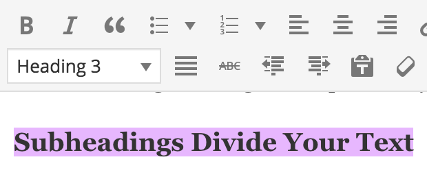
H2 or H3 heading tags (used to code the purple underlined words above) divide up your text on a website or blog post. Think of them as section headings in an outline.
Subheadings tell search engines what’s important on a Web page.
In an email, subheadings differentiate one piece of content from the next.
Once you customize the formatting for H3 (Heading 3) tags on a WordPress site, it’s easy to add subheadings to your text.
All you have to do is highlight the text and assign the formatting:
Short Paragraphs Rule
Forget about the rules for your high-school English papers and embrace the white space on your screen!
Short paragraphs break up dense text, making it easier for people to digest each thought and skip to what is of interest to them.
Aim for paragraphs that are only one or two sentences. Really! It may seem strange to write such short paragraphs if you’ve never done it before, but it’s a whole new world online.
Lists Categorize Your Thoughts
Vertical lists with numbers or bullet points:
- Group major points together.
- Make your text easy to scan.
It’s hard to pick out important points that are separated only by commas within a crowded paragraph.
Bold Attracts Attention
Use bold text to emphasize what you don’t want people to miss.

And … use it sparingly. If everything looks important, then nothing looks important.
Indented text in a different font, color, or background color also adds variety to the monotony of text.
Your Turn
What have I forgotten?
Feel free to share a blog post link from you or anyone else that you think has especially strong visual appeal. And tell us why.


16 thoughts on “Improve the Visual Impact of Your Email, Blog, and Website”
I used to place mid size images on my website but not anymore. 5-6 months ago, I switched for large images. After visiting other websites, I noticed how much I liked seeing as many details as possible when going through paintings. Other people are probably like me and, most of all, my potential clients.
Personnaly, I don’t like one sentence paragraph. After 4-5 paragraphs, I become a bit short of breath. I really prefer 3 to 4 sentences. But I keep them simple. My paragraphs end being 2 to 4 lines.
2-4 lines sounds doable, Helene. It does depend on the length of your sentences.
Hi Allison,
Interesting article. I didn’t know that trends had changed for images. I’ve been purposely keeping mine smaller – about 550 pixels for the greatest dimension. I’ll work larger with my next posting.
I do like how the colors of your subtitles support the colors in your heading and, perhaps coincidentally, they compliment the color in the paintings you’ve chosen.
I also like the clean look of your blog.
Margaret: Yes, this week it happened to be a nice coincidence that the images compliment my brand colors.
Images on my blog are 650, but I’ve noticed them wider elsewhere.
OH! Thank you for the comment and thank you for posting your image size. This is helpful.
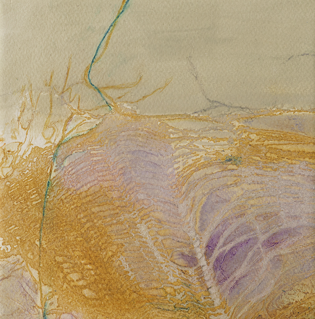
Great article Alyson and thank you for featuring my artwork in it!
Kind regards
Olivia Alexander
Thanks for sharing it, Olivia!
This was very informative. It used to be the rule that you showed thumbnails that would link to a larger image on your website and I have noticed many still do that. But I can see where the larger images would have more impact.
Kathleen: It makes a big difference when you hop from a page with large images to one with small ones. The latter look very old-fashioned.
I’m not an artist, so my e-mails don’t generally feature visual elements such as images. However, I still use certain techniques to get my reader to read all the way to the end of my e-mail.
My favorites are:
— bold a couple words in each paragraph to highlight the main idea; and
— bullet points
Another technique that isn’t visual, per se, but is important to holding the attention of the reader, is to proof and proof again to eliminate distracting type-o’s and misspellings.
Thanks for the great tips, Alyson!
Nice tips, Debi. Thanks for sharing.
These are some great tips I had not considered. I didn’t want my blog to appear too lengthy, so I was using smaller images. I just switched to full width images so we will see how that goes.
Also, having been a teacher, I tend to explain things fully. Breaking the information up into shorter paragraphs or bullet lists is a great suggestion. Thanks!
I had resized some images in my gallery to be larger, and then got some feedback that the larger images were more challenging on a mobile screen because people could only see one image and wouldn’t scroll through to see if there were more. So I made them a bit smaller. I’m wondering now if that was a mistake and I should just make them bigger again? Also, should I ditch the “home” page and set the gallery page as my home page? Thanks!
Looks stunning
Interesting article. It helps to have some insight from other people especially when I am trying to get noticed like everyone else is. It’s good to have an art community.
Interesting article thank you very much for such a nice sharing