Since I’m in the throes of the Art Biz Coach website redesign, I’m more than a little myopic right now.
I still get distracted by things I think I need to look up, like videos with Leo Castelli and Gilbert & George (from our Twitter book club reading of Leo & His Circle).
As I work on my site for the first big overhaul in 3.5 years, I thought about all of the forms the site has taken. I used the Web Archive to get a few screen captures for posterity.
This is really opening up a vein to you, but maybe it’ll make you smile.
The early sites are me trying to figure out what Art Biz Coach was all about. Because I was early-ish getting a website, I always thought of myself as a .com, so ArtBizCoach.com appeared on all of my logos and as a business name. No more! You’ll notice it disappears in my writing and my new Web design. I’m just plain old Art Biz Coach now.
So, you ready for the tour?
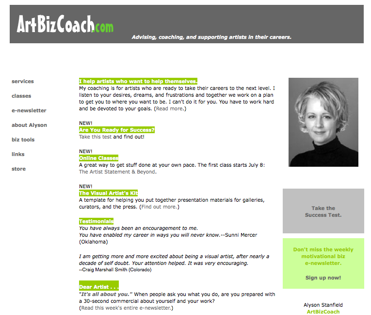
Here’s the first site. Really not bad except for that awful font in ArtBizCoach.com.
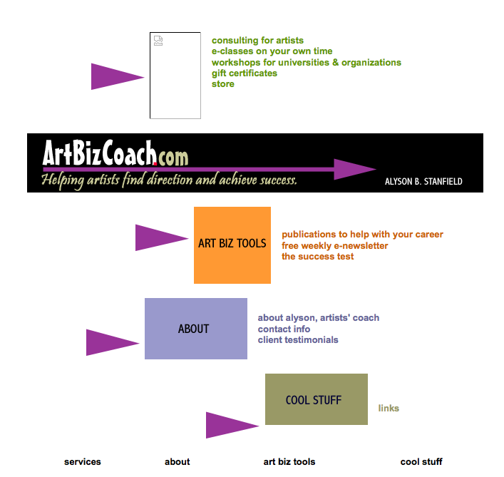
The second site–just a few months later. There really was a graphic at the top of this page. Obviously it didn’t work all of the time. I think I was trying to be fancy, but what a mess! Too many arrows and colors going on.
Wanna see more?
In 2003, I’m all about candy colors. I guess because nothing says business like candy. (Huh?) I still love these colors, but they never belonged on a business site, let alone an art site. It will remain notorious for the introduction of RED to Art Biz Coach.
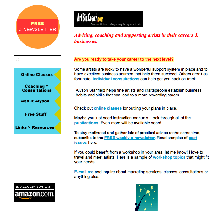
The following year I commissioned Brian Whisenhunt to do some original cartoons for me. And apparently it became Christmas year-round at Art Biz Coach. On the plus side, the logo looks less cartoon-y.

A few months later I learned how to write marketing text–mostly with the help of Robert Middleton‘s InfoGuru Marketing Manual. I also started the blog in the fall of 2004. You can see it in the left sidebar below. The blog was “Art Thoughts” at the time. Six months later I had a d’oh moment, registered Art Biz Blog, and gained clarity.

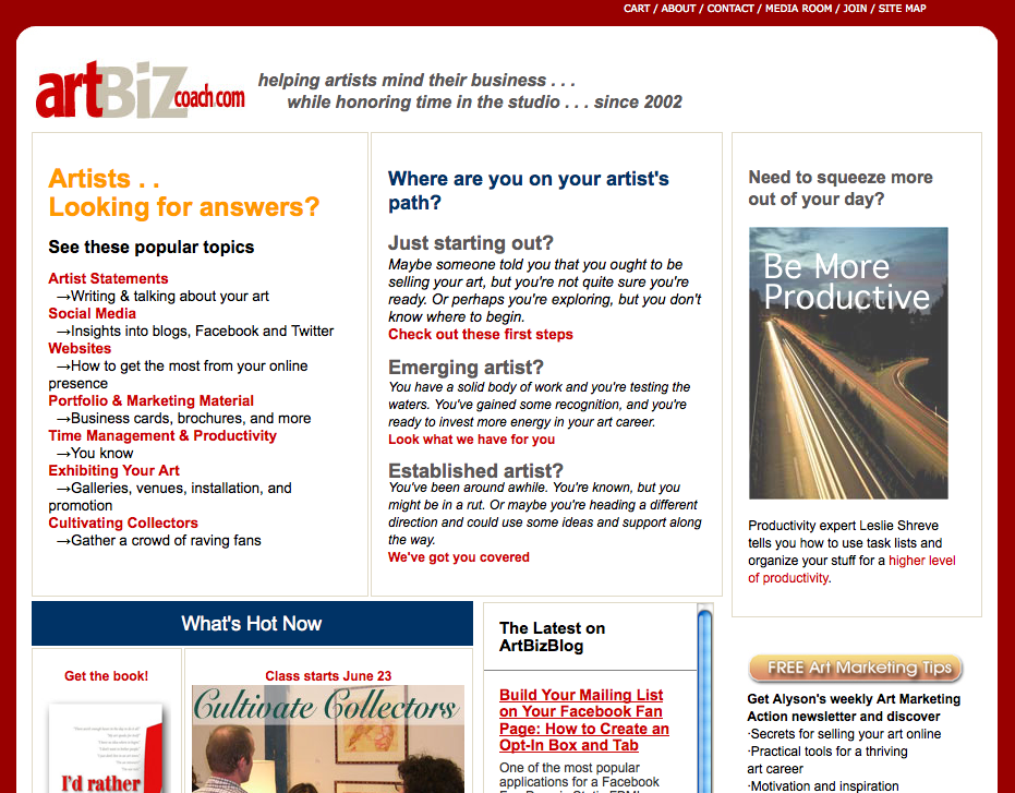
The above site lasted for 2 whole years! A record! Then I wanted big-time changes and went all out for red. I still love the looks of this site, which was designed with the huge help of Pat Velte at Whitewing Design. On the downside, the logo got even more cartoon-y than the original version from 2002. The red very much influenced the design of my book cover.

This lasted until the summer of 2009 when I realized my bounce rate on the home page was too high. What I have now isn’t lovely, but my bounce rate plummeted when I redid the home page. My name also disappeared. (ERROR!)
So, I guess we can only go up from here, huh?
Stay tuned. 5 days until lift off!


40 thoughts on “The Evolution of the Art Biz Coach Website Design”
Hi Alyson,
I’m curious about the last change, in 2009. What was causing the bounce problem and to what specific changes do you attribute its plummeting?
Thanks for sharing your evolution. It’s like a trip back in time. I love it!
Leslie
I’ll add that to the queue, Leslie. You could probably study the two and figure out why, but I’ll write something specific about it.
Yes, it seems the first one’s all about you and the second is all about your clients! Interesting that the second one doesn’t have an invitation to get on your list, at least not “above the fold.” That goes against what many are teaching now. So you’re bounce rate plummeted, but did your mailing list continue to grow at the same rate? Or faster or slower?
Hi Alyson! Nice page you got here. This will be very helpful for freelance artists to earn from their art 🙂
I really like the current design so have a hard time imagining an improvement on it.
Have to wait and see.
Karen: I think you’ll like it! Thanks for the vote of confidence, though.
VERY helpful to see the progression and read your comments. I, too, would like you to do a longer piece, or reference those of us who missed it, on the “bounce rate.” what you attributed it to, how specifically you addressed it and so on and on. Looking forward to the big reveal!
You got it. In the queue.
Loved seeing how you site has evolved, also interesting how your look evolved with it. I’m trying to figure out how to put my photo on my hosted site so people can connect with me more as a person. A thought for your new site – I was recently trying to locate some info I’d read in a blog and I think it was in the technologies sction, but with 178 entries I didn’t have time to go through everything. Would it be very difficult to put in a search function? Also adding my vote for an article on the bounce issue.
David: Thanks. There is a search function on this blog. It’s GREAT! Works super well. There really won’t be a need to search the website–I don’t think. There will be no articles on there.
Alyson, you can also probably use the Wayback Machine (web archive) to see early versions of your sites. Even, you can find sites that no longer exist sometimes.
David, most weblog interfaces easily allow you to upload a permanent image if you so desire. Even easier to place your image in a regular website -especially if you are using CSS to layout your basic page template. I myself don’t put my image on every page but it is there on my bio and statement page. You can see it at http://vener-art.com/about.html. Use your browser’s view function to take a look at the source code to see how I did it. Email me if you have any questions and I’ll try to answer them.
Patricia
Patricia: I did use the Wayback Machine. That’s what the link goes to if you click on it. I just didn’t use the write title for it.
Thanks for the tour. I love this post and may have to do a similar trip down memory lane next time I tackle a site makeover. My first logo font was the dreaded horrible “comic sans”. I tell artists pals wanting to create a website and wanting it to be “perfect” to let go of the perfect idea and not let that hold them back form getting it launched. It is smart to want to get things right the first time, but web design styles change, you change, and your business model can change. I am excited to see your new look!
Eeek. Not Comic Sans! I can’t say much as mine was fairly close to that.
Thank you for sharing your site’s development through the years. Your online workshop about blogs earlier this year was so very helpful as I sorted things out for my blog; this post spurs us think about what makes a really useful website. Will your site development adventures will lead to an in-depth workshop about website design? No doubt that would be welcomed by many!
Lynn: Pat (my Web guru) and I did a website redesign class a few years ago. It’s SO intense. Not sure about doing that again. I prefer the blog class.
Alyson,
I have especially enjoyed seeing the “evolution” as I’ve only recently found your blog and subscribed to your newsletter. Not sure where I’ve been? Maybe in my studio too much? I really appreciate the variety of topics, insights and different perspectives from other artists. Thank you so much.
Fabulous! I wish I had the early beginnings from 1997! In 2005 I turned over the design to a professional and it was the best decision, but I don’t regret the knowledge along the way. But those early ones were horrid!
Do you REALLY wish you had those, Linda? I’m so grateful that my early pages for the museums are long gone. Oh, I hope no one can dig those up!
Thanks for sharing throughout the years!
I can’t wait to see what’s next.
Hi Alyson
This a great tour down ‘memory lane’…I really look forward to seeing the ‘New You’ and applaud your on-going evolution…it’s a great inspiration.
Like Lynn Fraley, fellow classmate in April’s Blog Triage, I have so appreciated the way that you inspire change and the courage to make the change…
Thanks!
Alyson, you’ve always been an inspirational pioneer. Thanks for sharing your history here. Anyone paying attention would have much to learn not only from your changes, but also from realizing you take full advantage of getting professional help to improve all aspects of your website and your business. Can’t wait to see the latest iteration.
Barney: That’s a huge compliment coming from you. Greatly appreciated.
Alyson,
I echo those who would love to learn about the bounce rate of your homepage and why you think the redesign helped avoid that. The comments of others lead me to believe that I am not alone with this challenge on our websites. We live to learn…=)
I enjoyed the trip down your memory lane. I think I remember the circa 2002 version, and still have the printed cards! Not like I can locate them easily now (shame on me), but I do have them, LOL.
Looking forward to your overhauled look! By the way, if it is to better your newsletter, then drop the personal stuff. =)
Angeline
Yipes! Really? 2002? What are you doing holding onto those cards?
Hi Alyson,
You’re too hard on yourself. Your site has actually always been great,
and always moving with the times. Can’t wait to see the next act.
You are always an inspiration.
Barbara
What a great idea, and how brave of you to do this time machine for us. I’ve got some cringers in my web past, but that’s what you get if you’ve been online for 11 years – things change a lot!
Can’t wait to see the new site! oooooooo!!!
Thank you, my friend! Backatcha.
I really appreciate your openness to sharing what you have learned, the good and the bad, and just being real with us. I think that’s what I love about you so much. Thanks
Yes, thank you Alyson, for you inspire by being a fine example of a real human being:) who is constantly growing & creating life & business to be even better. I really appreciate all that you have done for others while you are evolving and taking us with you!!!
You two are very sweet. I’m grateful for your presence here.
I had fun playing spot the difference and figuring out why your bounce rate went so high! Can’t wait to read the article and find out if I’m right. And of course, dying to see the latest incarnation of the Art Biz ID. Will there be a new hairstyle as well? 😉 My hair is generally even more of a challenge than my blog design. When will someone invent CSS for hair?
For years, my policy has been to not comment on the comments on my hair (long long story). I think I’ll stick to that.
Alison, I do like to read your ArtBiz articles and hope to keep doing so. good luck on this move. Don T.
I quite understand but its great hair! I’m only envious…
I thought it was nice seeing the evolution of you as a person along with the evolution of the page, I was imagining you in the different eras.
Can’t wait until tomorrow 🙂
Wow – what a transition! Looking forward to the next design. Funny how fluid the state of a website is. Hope you keep the red – that’s definitely a signature. It should be a hit!
Jennifer
Pingback: How to Launch a New Website or Blog — Art Biz Blog
Dear Allyson:
This, i.e., your chronicle of various website designs, is one of the most important blog posts of the year.
I’m recommending it far and wide for all of the lessons it teaches. Congratulations on your new site and for sharing the journey to the present.
Roger
Peace, Allyson.
Thanks for the trip down memory lane. I enjoyed seeing the cartoons, 2004/2005, I guess it brings out my inner kid….what fun!. I look forward to the new. Hope you kept the red…hmmmm, a signature power color.
Kaitha Het Heru
Pingback: VisualsSpeak Reflections: Let’s Get It Started! - VisualsSpeak