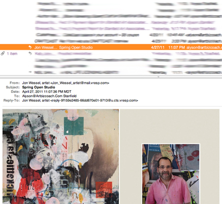
Most of the email messages I receive from artists and galleries have text at the top. There’s usually nothing wrong with text at the top of the email, but I’m convinced that recipients are more likely to open and read a message when the art is at the top.
I had this epiphany when I saw this invitation from Jon Wessel in my inbox.
My inbox is a split screen: messages on top and preview on bottom. I don’t open all of my email messages. I’m sure you can understand that most of them aren’t worth opening.
But with this invitation, Jon gave me reason to open his email all of the way. It’s simple, really.
Jon placed his art at the top of the message. The art is what I see – along with a nice photo of him. So if I’m interested in his art, I’m going to open it to read more.

What do you think?
What's at the top of your email message?
- Alyson Stanfield
Share this post
Happening March 31
ART BUSINESS RESET
We’re at the end of Q1. Is your 2026 plan still working?
In this 90-minute live work session, we’ll get a big picture view of your art business, looking at the same areas I examine with every private client.
The goal is to find your highest-leverage move heading into the next season.


9 thoughts on “What's at the top of your email message?”
I don’t like very much when there are images or other stuff before the text. I like newsletters or email with a nice, may be coloured, template, but I don’t like to have to scroll down the email to read the text.
I’d prefer a small picture, like a thumb, on the side of the text.
May be this is because I am the kind of person that read film spoilers and that read the end of books as first thing. I don’t like to wait to know 🙂
I also prefer e-mails without (large) pictures. Furthermore: all this doesn’t work if the recipient turned off pictures/html in his e-mail-program (which for security reasons still happens often). Then they see something like a black border with a red x, which really doesn’t look nice.
Hm, I guess it depends on the recipient and one’s reason for sending the email. I actually am one who has images turned off. It makes for speedier loading. If I’m interested I’ll turn them on. Some emails (from Agway for example) are all image and no real text. Somewhat annoying. On the other hand, if I am one of many sending an email to get someone’s attention for my art, I would consider having an image along with the text. A small image. Kind of like Alyson’s old newsletter format. Heh.
Ooh you are so smart Alyson! Just today I got a new venue & we agreed just to have one work of art, but to send an email first to check…So I got home, read your blog post, & figured out how to put a picture in an email body at the top…(I got the Flickr html embed code, turned on “make rich text” in my email provider, then clicked the word “Source” to allow it to accept html…) I have never been able to do this before, but your push forced me to figure it out… So tomorrow the gallery will get a snazzy email with the painting I chose plum at the top! Thanks, that is great & great timing too! (*& for anyone who is not in the ‘artist conspiracy’ yet, here’s a thumbs up from me-since it forced me to seek out new venues in the first place!)…
I can only speak for my own experience. Don’t forget people like me.
Sari: Congrats on the new venue! So happy to hear that the Artist Conspiracy was a motivator.
Let me know how the email works.
Just wanted to say that the email worked so well, I got a response of a yes from the gallery right away on the painting that I chose to (embedded html code from Flickr pro album) feature at the top of the email I sent to them…This is the first time I have (just learnt how because of this blog post) embedded a painting right at the top of an email to a gallery & it is also the first time that I got a rapid yes from a gallery on an email…This may seem like a little thing, but this detail was a big deal for me just now…
Now I just have to deliver the painting to them…(This is a brand new venue for me)…
That’s wonderful, Sari! So happy to hear that it worked and that you have a new venue.
Feel like I need to mention that Jon’s email was only 8.7 KB. So it wasn’t a huge-sized email by ANY stretch of the imagination.
Jon Wessel does a lot of things right. His artist’s website is absolutely beautifully designed. http://http://jonwessel.com/ – Note that if you reload the landing page, the image changes. Nice touch!