It’s great news that we no longer have to scramble at the last minute to have slides shot, developed, and masked. You can insert images into your digital presentations up until the moment you are introduced. It’s magic! It can also be tragic.
 |
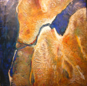
| Leslie Sobel, Desert Passage. Satellite imaging, encaustic, and mixed media on canvas, 24 x 24 inches. ©The Artist |
PowerPoint gone wrong is a hideous sight. Bad PowerPoint consists of incongruous colors, over-designed slides, too many slides, and, mostly, too much text. If there is too much text, you wonder what you paid for or why you’re there when the entire presentation is written out on the slides. You might as well have stayed home and received the slides as a PDF file in your inbox!
Here are some tips for designing and perfecting the digital presentation of your art.
DO start your presentations with a blank slide. I prefer black backgrounds, which serve the same purpose of the old silver tape we used to use when masking a slide. This blank slide keeps the focus on your art.
DON’T use a template design. There should be no design on the slides other than your art.
DO be consistent with colors and design throughout the presentation.
DON’T use bullet points. These are old school. For those of you who have seen bullet points in my presentations, I apologize! I’ve been removing them completely in the last few months.
DO avoid as much text as possible. I have begun using words mostly as graphic elements next to or on top of a handsome image (art or stock photography) when I introduce a major concept. These are usually single words or two-word phrases that take up about 40-50% of the slide area, which are there for impact. You don’t need words because you have your art!
DON’T put image titles next to the art. You shouldn’t care if your audience recalls the title. You want them to be entranced with the work itself–not the title.
This should be obvious, but I have to say it: DO use great photos of your art–the best you can muster. Don’t use cartoony clip art, which is another relic from the past.
DO get permission to use images, text, and music that aren’t your own as these are copyrighted materials.
DO practice with the remote control ahead of time. All remote controls are different, so you want to get a feel for the one you’ll be using. I use PowerPoint rather than Keynote and like to project the slides in the mode called “View Presenter’s Tools.” This allows me to see the next slide before I click the Forward button.
DO stage a rehearsal to project your images with the LCD projector you’ll be using. Color varies greatly on these machines, and you will be far more concerned about correct color than previous presenters who were just sharing slides with lots of text. On the projector, fine-tune the color as needed and use the keystone adjustment to tweak the projected shape into a perfect rectangle.
DO work on the words you’ll use to go along with each slide. There will be more about what to say in next week’s issue. Can’t wait? Check out your copy of I’d Rather Be in the Studio! (pages 53-67).
KNOW THIS———-~> The design of your digital presentation should put the focus on your art.
THINK ABOUT THIS—~> Is your digital presentation stuck in the past?
DO THIS————~>Design your PowerPoint presentation so that it puts the focus on your art. Remove all unnecessary words and eliminate template designs.
Share your thoughts and listen to the podcast on the Art Biz Blog.


