After yesterday’s question as to whether or not newsletters were still valid, I thought I’d share one of my favorite newsletters.
It comes from the American Craft Council.
Why I Love Getting Newsletters from the ACC
It’s simple: The ACC newsletters are gorgeous.
They’re not overdesigned as so many art and artist newsletters are (too many colors, too bright, too many fonts). Instead, the focus is on the art.
AND, the art has a theme. Art by one artist looks great next to art by another – because the images were carefully curated.
Let’s look at a few snapshots from the July 15 edition.
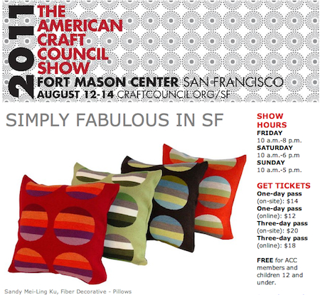
Here’s the header.
Notice the dotted background. I would argue that this isn’t needed, but if you’re going to have a pattern, it should make sense with the selected art.
The top image of the patterned pillows with the echoes the dots in the header and adds stripes. It sets the tone for what is below.
(Remember, these are my screen captures and crops from their email newsletter.)
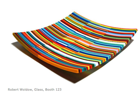
A striped tray!
No dots, but it coordinates with the stripes above. And acts as a transition to . . .
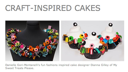
A bonanza of dots and stripes in this necklace.
. . . and the cupcakes inspired by the necklace.
I’m Not Encouraging You to Make Art with Dots and Stripes
I’m asking you to think about how your art is visually laid out on a page.
How do your colors, fonts, and images relate to one another? Squint your eyes. Is the art the most important element in the message?
If you add an extra color or a background element, does it enhance or detract from the work?
Can each newsletter have a cohesive theme that ties the work and words together?
Can you add some fun?


16 thoughts on “Eye Candy in My Inbox”
Gorgeous!
But what makes this a newsletter? It looks like a postcard invitation to me.
Laura: I probably wasn’t clear. I said “a few snapshots from the July 15 edition.” These are all MY screen captures/crops from their email newsletter.
Thank you for clarifying.
I very much prefer YOUR edited version of this “newsletter” (sans text) to the ACC’s.
I agree. The simplicity, and the focus on the art (with a theme constantly in mind) pulls you right along. I’m wondering whether that dotted pattern in the header is something they always use, to provide consistency between newsletters. If so, they might want to go with something simpler now; the suggestions of quilts and crocheting seem a little restrictive, especially considering the kind of work they’re showing.
What slows me down from doing something like this is that I’m not sure how many images I can use before I start to bog down peoples’ mailboxes. And is there software that lets you play around with the formatting in an email — and gives you some assurance that the thing will display more or less the same on different email programs?
Arthur: I suggest using a program like Mail Chimp and not doing it from your own software.
Love it! I’m just getting started, but I’m selling art, not news. Plus, I’ve heard to not make the news about myself. As I write my newsletter, I ask what is in it for the reader. People, including myself, read really fast. (this is why there are headlines) Pics of beautiful art stop me from scrolling down the newsletter. As a galley owner. I look at the pics, pause and say wow, then I look to see the details. I don’t need to know the artists name, medium, or history, if I don’t like the art. Stop the readers with your beautiful art, then they will take the time to read the news. And hopefully make a purchase.
Pam: And put the art at the top!
I think your point about the beauty of how one’s art comes up and is arranged in a newsletter is very important. But I daresay the ACC newsletter (I believe that was it!) has a hired person who has dedicated time to do such a gorgeous newsletter. Most of us artists do everything, or most everything, ourselves. If I couldn’t put out something that I was visually proud of, I’d rather not do it.
That’s right, Lynne. But you are an artist. You know what looks good and what doesn’t. Compose it as you would compose a painting.
Just looking at the investment of time and how I’d probably rather spend it….on other aspects of my promotion that I am already doing (as you said on the CC course!).
I have always loved glass art, and that tray looks completely edible!
Yep, Tim. That’s why I called the post “Eye Candy.” Tasty!
Thanks for the reminder, Alyson. Good design is good design. Whether in newsletters, blogs, websites or anywhere else, it is important not to get off track visually, especially for us artists. With so much competition visually screaming at us, sometimes the temptation is too scream louder…but when I want noisy kids to hear me, the best approach is to whisper. Since I hope to get my website (closer) to completion this week, your reminder will be at the forefront of my mind as I work on it. Thanks again 🙂
Susan: I like that thinking. Send a whisper instead of a shout.
Pingback: A Twist on the Wine-and-Cheese Reception — Art Biz Blog
Pingback: Movie Review: No Strings Attached | Movie Star News As It Happens