Facebook says pages and profiles will be forced to adopt the new timeline by March 30, so you might as well adapt now.
Here are 4 starter moves for hopping on board the timeline train with some inspiration from artists who have already converted.

1. Cover Photo
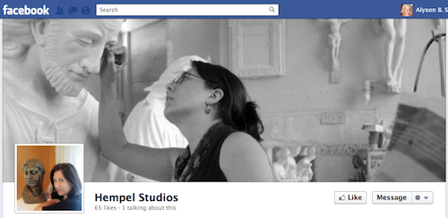
The biggest change to the new Facebook pages is the addition of what Facebook calls the cover photo. It replaces the photo strip of five images at the top of the page. This should be some version of your art.
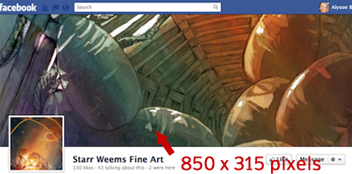
The cover image is 850 pixels wide and 315 pixels high. Facebook forbids promotions, calls to action, and URLs in the cover image. Read their brief guidelines.
Note, too, that the area visible when the profile is first opened is just 115px tall. So, it’s good to get something intriguing in that lower 115px of your cover image.
The graphic at the top of this article has a terrific explanation and diagram of the size and placement of the cover image.

2. Page Profile Photo
You still need a profile photo for your page. All of the social media gurus are encouraging logos be used for profile photos, but it’s my hope that your logo is your art.
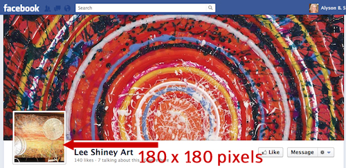
As always, I suggest a good picture of your art for your page’s profile picture. It needs to be strong enough to stand out on other pages when you comment on them.
Page profile photos are 180 x 180 pixels.

3. The About Box
Info about your business now sits just below your page name. Depending on how you described your business, Facebook pulls information automatically for this spot (address, URL, phone number).
You can override the default by editing the About section. Click on About/About Edit and then scroll down to fill in the field named (you guessed it) “About.” Use this space for a brief (5 or 6 words) synopsis about your art, your URL, and perhaps one other link.
There is no need to repeat your page name here because it’s already at the top in large letters.
4. No More Welcome Page
For those of you who took my advice last year and created a Welcome page (a.k.a. “landing page”), I’m sorry. Welcome pages are no longer as useful as they were previously.
You can have a Welcome app tab, but you can’t make it a default landing page.
I’m still exploring the apps tabs and, as I often find myself on Facebook, am frustrated that things aren’t working as promised. I hope to have more for you about this in the future.
How have you hacked the new Facebook timeline for your art page? Or are you hacked about the changes?


50 thoughts on “4 Starter Moves for Your New Facebook Timeline”
Thanks Alyson! I am not a fan of the timeline as I find it visually chaotic and I also hate how it crops images, so will wait a bit longer to convert. I have noticed artists incorporating their urls into their cover photo and was going to do the same, but see that it is “forbidden”. I just wonder if they will they shut you down if you do it?
Casey: Why run the risk? I’m a “play by the rules” kinda gal and don’t want to be perceived as cheating the rules.
PS: You have 2 weeks to convert.
Chances are they will not see it… If your profile or page gets reported, then you run the risk of being noticed for the URL.
Chances are you will be faced with one of three things: 1) Your cover photo will be removed forcing you to upload a new one, 2) Your account will be locked/suspended with the reason being the violation – probably for a day to 7 days, 3) Your account will be shut-down — this last option is unlikely, but they do have the right to do so…
— I am a product designer for FB —
Ryan: Thank you for sharing your knowledge here. We really appreciate it.
Thank you so much for this article! And to Casey for the perceptive comment.
I *hate* the timeline and the new setup for viewing images with the info, ads, etc., up front and in your face. Maybe this will help me take a deep breath and try to get it together. ^_^
Hah! Just published my blog Facebook Page to timeline – and then read your email letter!
Of course everybody will have their own particular perspective – but the imperative for me is
1) tie this site into other sites where I have a presence
2) avoid deterring people from wanting to come back.
The challenge for me is that I use my Facebook page to publish blog posts from all my blogs. So the important thing for me was to NOT make it particular to one blog. So I’m using the page profile photo for the brand icon (my blue M). The reason for this is because it is used elsewhere on other sites and will be more enduring over time as well so it ties the whole branding thing together.
I’m finding some of the “in your face” images I’m seeing on some Facebook pages to be too much – they make me disinclined to visit again! Which of course is a “fail” when it comes to the aims of this particular exercise.
Hence I decided I didn’t want anything which drew the eye too much. I’m using a scan of a sketch of visitors to last year’s BP Portrait Exhibition as my big image up top. The overall effect is recognisable – it says “Katherine” to anybody who knows me and my blogs – while at the same time being quite understated.
I don’t like Timeline AT ALL. It seems very clunky and always takes forever to load. The concept also is bizarre… who cares what happened way back when? (Except our moms?)
I agree! It takes forever to load and I find it very hard to read bacause it’s left and right blocks of words, pictures, etc., all random all over the place. I want to read down it in order and not miss anything.
It’s so jumpy, too, isn’t it, Nancy?
Juuri: What happened way back when is helpful for businesses (remember, these are business pages) to tell their stories.
Of course it would have been sensible if I’d included a link so you can see what I mean!
https://www.facebook.com/makingamark2
I agree with everyone else about the look of the Timeline – and I especially dislike the cropped photos. Thank-you, Katherine, for posting the link to your page. Your blog posts fit on the page so well! It looks simple, clean and neat. Easy to read. Very professional. What a great idea!
I like the look of timeline but I think Facebook is being silly by disallowing text in the cover photo (I can see how some businesses can get carried away, but there will some pretty things, like typography options, that could have been…sigh)
also, I admin a few pages and I am finding publishing them in the new format buggy- just goes back and forth from “live” to “preview” and some of my connections see it and some don’t. Looks like mine won’t be able to make the switch until it is mandatory 🙁
Amanda: I don’t think they’ve disallowed text – just URLs and promotional “like my page” kind of stuff.
Buggy indeed!
Hello Alyson,
Thank you for your quick “tutorial” on the new Facebook Timeline. It is frustrating that Facebook has so much power they can change the format at whim and we don’t have a choice (other than to opt out). I am ranting about the latest changes to our Facebook welcome page. When I go to my own “new” format Facebook business page, I only see a “star” and not the welcome page. Could someone please go to my website at http://www.frostphotography.com and click on my Facebook link and let me know if the link takes you to my snow scene on my welcome page. Thanks!
Susan: As I said above under #4, Welcome pages can no longer be landing pages. But you can grab the URL of your app and send people to your welcome page instead of your wall.
I’ve got tulips Susan. It’s “all change”.
The Timeline idea gets a thumbs down from me for my personal page although I can see how it makes sense for a brand. It’s much easier to see all past posts – which if you’re selling art can only be a good thing.
Anybody know how to make “posts” view stick as the default option for my page. I’m really not into showing everybody what other pages I like in quite such a prominent way – I want space for my content!!!
Also I make extensive use of groups on my personal page (as opposed to blog page) and I’ve got no idea how to access these after the change
Katherine: You can Highlight a post and make it go across the page (thus dropping the Likes down). I do this at http://facebook.com/artbizcoach
As for sticking, FB calls it pinning. Click on Edit (the pencil) and “Pin to Top” to get your content to STAY at the top. You can always unpin later.
Re Groups: do you mean Lists?
It seems to me that the old adage “If it ain’t broke, don’t fix it” applies beautifully to all the changes taking place in FB land. This change was made to benefit FB (increased ad placement/revenue) NOT the users that made the (admittedly free) service what it is today… I am dreading the forced change; the more I read, the more I dread it — trying to get into a ‘go with the flow’ space about it (obviously, none too successfully). I appreciate the tips in this post, and will make the best of it when the time comes 😕
Penny: Of course it’s to benefit FB. That’s what FB does. That’s what they’re in business for. That’s why you should never ever ever put all of your eggs in the FB basket. You must build your own strong brand off of social media sites.
Hey Alyson,
Thanks so much for the great information. We (John and Crickett, hence Crickenbacher) are just getting started and are really hunting and pecking through all of the options that we have in the social media world. We are finding your site useful. The “eggs in one basket “comment is a great reminder for us to continue expanding our presence.
I too am unhappy with the format of the new FB. It reminds me of the ‘myspace’ that we left for FB. My eye gets lost and I am sure that I miss things, but it is free so who am I to complain too much….but still. I guess I am a true American in that I like choices. Aah well, we are all just trying to do our best for our business I think.
Thanks, and keep the info flowing. It really helps the newbies.
Thanks for being here, John and Crickett. I’m glad you’ve found a reason to return.
For those who resent being pushed – as opposed to having a choice – it seems various people have started a “I hate the Timeline, bring back the old format” group on facebook – here’s one of them…. https://www.facebook.com/pages/I-Hate-Timeline/321001574591089
Katherine: Seems like a waste of energy to me. Besides, I won’t join any group with the word “hate” in it. Been trying for too long to eliminate that word from my vocabulary.
The way I look at it unless you give feedback there’s no way Facebook understands how many people hate the new Timeline.
I do hate it – I’m just being honest. Intensely irritated by it would be another way of describing it. I personally will be using Facebook a lot less if my personal account goes the same way.
I do understand that it’s better for business and being able to load pages with adverts. However like many other Facebook users I get turned off by a site that becomes too much about making money for the owners and not enough about giving clients/customers/members (that’s us) what we want.
I do also remember how many changes faceback has backtracked on before after Facebook members told the owners what they thought of it. So I think it’s worth telling them – and on Facebook that’s through groups.
Bottom line there’s no social website which survives ignoring its members or the fact that other ones come along. Remember MySpace?
I totally agree with expressing disgust with the new changes.
I have very bad astigmatism and the TImeline layout literally makes it impossible to read. So basically, if you have any sort of visual problem, you are useless to Face Book.
The only reason I stay on there is because I run Social Fixer over it, so on my computer there is a BIT of sense in how things are posted and displayed.
Otherwise….to heck with Zuckerburg.
It is impossible to READ.
Let it go the way of MySpace~~he deserves it.
I like the new timeline. It seems people always freak out when facebook changes things, but then everyone gets used to it ;).
Thanks for the ideas with the cover image. I’ll be changing mine soon!
I have mixed feelings about the time line changes I took the initiative to change all of my pages over before I was forced to suddenly by FB, I didn’t like the Big long Horizontal cover photo at first but when I found a couple of compelling Horizontal Photos I got to were I like the cover photo plus I have seen where people have spliced together a couple of their photos to fill the space and that works well too. the big down side for me is how badly it crops photos that I post and the fact that you have limited control of how they are cropped isn’t good plus if someone post something on your wall it pushes everything on down the timeline into oblivion. It takes some getting use to but it is what it is my feeling is don’t put all of your eggs in this one basket, use it for what it does best and leave it alone for what it doesn’t. I think I might need to look at Google+ as an alternative
Alyson,
You said, “You can still have a Welcome app tab, but you can’t make it a default landing page.”
That is true, however, you can still LINK directly to whatever app tab you want (which might be especially effective with a custom url redirect).
Example: direct link to FASO’s newsletter signup app tab
http://www.facebook.com/fasobuzz/app_141860442520905
So our website code code say:
Visit us on Facebook!
and it would go directly to the app tab instead of the timeline.
Just a little tip I thought someone might find useful.
Absolutely, Clint. You’re anticipating my future posts.
So, instead of giving people your Facebook wall link, you can link them directly to your Welcome page or any other app tab..
Since there’s really no choice about the new format, there’s no sense in grinding our teeth over it. It is still very buggy, and I’ve fixed mine up as best I can for now and then hit “publish”. I created a landing page a loooong time ago, and am very disappointed that it won’t be used that way anymore, but oh well. One of the bugs is that I’ve been unable to get my chosen image to upload to the tab for my former landing page, now just titled “My e-books”.
Great, helpful, fascinating comments. Thank you all, and now I must unsubscribe because there are simply too many.
I’m among the very few who actually like the Timeline. Actually, what I like is the cover image, and the ability to use it to showcase my art. Right now, I have a collage of images which fits within the available space, and I was able to incorporate both my blog and website titles (not the URL…following the rules!). When I get tired of that, I’ll change it to something else; perhaps just a single image of my work. I don’t pay a lot of attention to the timeline–I agree it’s hard to read because it’s not linear–I’m more apt to view comments on my page’s newsfeed, which thankfully, hasn’t changed. http://www.facebook.com/KindredSpiritStudios
I just want to chime in and say that I love the new timeline. To me, it seems more visual and more intuitive. Thank you Alyson for your advice.
As for those that are angry about FB having the ability to change their format or seek revenue, try to look at it from your perspective. Presumably you are your business and would like to control your format and revenue. It’s the same.
Facebook will always be changing one way or another, so the best thing is to just deal with it. Everyone screams, whines, threatens to quit, starts “I hate…” pages and it’s a waste of time that could be better spent making art.
I changed over months ago and, guess what, it’s no big deal, other than you can now hit people with a nice big image of your art. Not wild about the Timeline, but most people rarely go to anyone’s page anyway, so not worth worrying about.
I like some of the aspects of timeline and not others. I think they could have done a better job with the look and feel, but I love the large cover image (which I am currently using to showcase my latest and greatest and will change to the next big thing as it happens I think) and the chance to put in all my past shows as milestones. I think it will be a really great way to showcase my career and hopefully connect with others who saw the exhibits. this will take a long time, but I think it will be worth it.
Thanks for the kudos!
I personally love the new timeline! (Except how slow it loads on my iPhone.) I like the more heavily visual aspects of it and I tend to think about life in a visual timeline. Anyway, I’m having fun with it.
Here’s a glass-half-full opinion: I don’t mind the new pages. 🙂 Firstly, we finally have an image up front and dominant on a business page. YAY! The “above the fold” is now clean, professional and hits them immediately with relevent content: the art. This was the main reason I ever even made a welcome page using Wix.
Secondly, people don’t see your timeline page much remember. Once perhaps, then they follow you and your feed is in their home page (which looks the same as it always did – a running list of updates)
Thirdly, although you can’t set a default landing page (boo!) you can still have a Welcome page/tab and still use that for any time you promote your Facebook page. So I’ve used a link directly to that ( https://www.facebook.com/Tinatheartist/app_129982580378550 ) for any advertising, promotions, etc. So at least we have some control for traffic we generate, and that can have urls, calls to action, etc.
Tina – good point about the timeline re those pages you have liked
Like I said I can sort of understand why this format works better for ‘business’ pages on Facebook. I’ve looked at those of a few artists and it’s so easy to see which images are sold and not sold!
However it’s my understanding it’s going to apply to both pages and normal accounts (ie the bit of your Facebook account which isn’t a page!)
It’s the latter where I don’t want the timeline messing up my nice easy to skim read wall! Plus at the moment it’s a doddle to access all my groups which are listed off to one side – and at least half my facebook activity is spent in specialised groups – and I can’t see how these fit with the normal account.
Would this format be applied to the profile page of my ordinary “me” account?
But then I was never very good at understanding the difference between ACCOUNTS and PAGES – but I do know I’ve got a separate avatars for the Katherine Tyrrell account and the Making A Mark page
One other thing you can do is change the images on the app boxes that appear on the right of your about box. I think photos and likes are fixed, but for other apps you can change the image in the page editor. The image size should be 111 x 74 pixels.
Yep. You’re getting ahead of me, Dan. 😉 But I’m finding it’s not working with Static HTML apps. Very frustrated with those right now.
I’m totally confused . . . I managed to get the cover page changed . . now I have only a week before it goes public. As I try to change other things, they seem to jump around and I get confused. Also, with the new Timeline do we still have ” 2 pages” — the business page and the Profile page? Are they managed separately? I have always found that to be confusing.
Marsha: Presumably, you have 1 page and 1 profile. The page is attached to your profile.
Also, as I have gone in to experiment on my new Timeline, everything I add or change seems to be locked in . . there are 2 “colleges” that are the same. How do I get rid of one? Things keep adding on or growing and I can’t seem to control it . . . Is there a “Facebook for Dummies?” 🙁
Marsha: I’m sure there is such a thing, but it would have to be rewritten every few weeks! Just know that you’re not alone in your frustrations.
When my studio page switched to TImeline, at least one post vanished. It was one with more comments than most of my other posts and linked to a newspaper article about a show I was in. I was not happy to see it gone. I reported it, but it’s like filing a report into a vacuum. Apparently, quite a few people are having this problem. Timeline is buggy. I like the ability to have a cover image, but I otherwise hate the look of it, and find it difficult to navigate.
Ellen: I’m sorry this happened to you.
Many people are upset with Timeline. Count me among them. Traffic is WAY down and I hope FB offers another of its “fixes” soon.
One day the “powers that be” will remember to ensure that their developers have customer service awareness as well as all the techie skills required for new developments. So often a technical enhancement fails to satisfy the customer – and I’m not talking short term here.
If traffic for an established product/service with a long-standing customer base falls off you can be sure somebody got the techie bit wrong in terms of what the customer wants.
I just wish we could actually get the FRESH content above the fold.
How do I permanently get rid of “likes” and “activity”? They add no value whatsoever to people looking for new content!
Katherine: I don’t know about “activity” but you can switch out your Likes tab with another one if you have more than 4. My Likes tab is only visible when all tabs are opened.