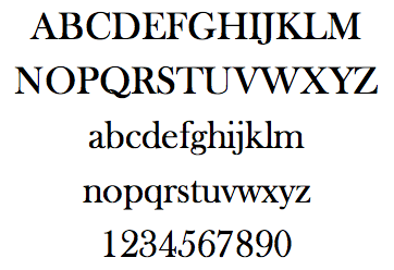
I’m in the midst of selecting fonts and styles with my book designer. Do you know how many fonts are out there?! Seriously. Do you know? Because I want someone to count them all. And then figure out the subtle differences among the various serif fonts. It’s crazy!
I’m convinced these typographers are part of a cult. But it’s a cult that is way cool. They do not take this stuff lightly.
I’m afraid (yes, deeply fearful) that I could look at fonts all day long and still never find THE perfect font. Check these out:
fonts.com (some cool free fonts, too)
Typographer.org
Typophile
FontLab
Type Basics from typeworkshop.com
Answer: Baskerville Old Face


15 thoughts on “The font count”
Also “myfonts.com” has a terrific interface for comparing one with another.
Ok, I have acttually done this one…here’s how…(I worked with a graphic arts firm & they had about a thousand fonts to choose from)…You don’t actually look with your brain really, you just kindof skim down the page really fast …the more you have to look at the faster you skim…A font will leap out at you…just leap…stop there, pick it, then ask your people if they are ok with that…that one will make you happy…that is most important…it will describe what you are trying to say…you will like it…don’t pick something if it doesn’t leap…there are enough choices that there will be one just for you…(if not, there are people who will actually create the font of your vision…) anyway, it won’t be an intellectual decision, more of a heart gut thing …(although a politician might put it to a vote…) good luck, I went with the childish scribbles – seemed the least commercial …(but that was five years ago, today I don’t know…)
My instinct says Garamond, or some variation thereof? But it’s not quite. I’m afraid I’m a bit of a font geek, I love typography. I’m rubbish working with it creatively though and admire designers who do amazing things with type. I did typography and hand typesetting with lead type back in my publishing degree. Lovely stuff! And I have the Linotype posters. 🙂 I’m not so geeky that they’re up on a wall though, but it is tempting in the new house! Fonts say a lot about an image. Contemporary or traditional? Light or bold has a strong psychological effect on our perception of the writing or brand. Plus it needs to match your product of course, or you can use it to completely change the perceived market for your product. Mixing fonts is actually quite difficult to get right. And of course there’s the actual design of fonts, good ones have a balance and flow of letters you almost don’t notice while a bad one somehow just doesn’t seem to sit well. Fellow geeks need Jan Tschichold’s “The New Typography” (if they don’t already have it, of course). Interesting tid bit: it used to be that serif fonts (with twiddly bits on the ends) were recommended for reading over sans-serif. This was because serif letters evolved from handwriting. Nowadays sans-serif is often recommended, a direct result of our changing technology and the fact that we now read vast amounts onscreen where standard fonts tend to be Arial or Helvetica. Sorry, I’ll go geek out on my own now. 🙂
What a lost art. So many graphic designers today (I sound so OLD when I say that!) don’t spend enough time learning the art of typography, how to kern type (adjusting the space between the letters) or the subtle differences between typefaces. I’m so glad to hear that you are taking the time and interest in the design of your book, down to the last letter. Can’t wait to see it.
I would have said New Century Schoolbook, but then it’s been 20 years since I had a typography course and worked in graphic design. Selecting the right typeface is very important to any design project, like selecting typefaces for the text of your book and the title.
I also hail from a graphic design background and the days of copyfitting when it required a calculator and the measurement of characters-per pica of a particular face to determine the exact point size and leading to fit a paragraph into a type area that measured 13.5 picas wide by 24 picas deep. Today’s prolification of typefaces can be attributed to the ease of recreating, editing, updating and creating new faces with digital tools. The entire universe has accelerated and typography is definitely an vital element in this ‘information age’. I believe the old standard of using a serif face for books and newspapers is based on sound statistics which indicate that it is easier and more conducive to reading large areas of text if the variation in the letters is more distinctive, as it is in serif type. Because of the flicker and backlighting of computers, it is, again statistically easier to read large areas of text in san serif faces. My personal preference for a book type would be the Palatino family. It is a bit more elegant than the traditional Times and not as bulky as a Century Schoolbook. But I’m sure there are hundreds of choices depending on the preferences of your typographer, publisher, etc. Have fun and make sure you are pleased with the look!
I’m guessing Frys Baskerville or some derivation of Baskerville… Having studied lettering and having been a calligrapher makes one aware of the nuances of fonts. Garamond and Palatino versions are both easy to read. The more ornate the font and its serifs, the harder they are to read. good luck, Alyson!
Aaah yes. I am in awe of those true font afficianados, who can name that font. I work in design and have to admit my process is more in tune with Sari’s. Skim until one jumps out – the intuitive approach. There are many that are similar but it’s the nuances that get my attention. Good luck!
I am a huge fontophile, but know very little about fonts for reading, except to use serif for print and sans-serif for websites. A friend of mine in the graphic design biz turned me on to this website http://www.thinkingwithtype.com/ So are you saying you actually have the opportunity to choose the font for your book? That’s pretty amazing. ~Sue O’Kieffe
Good luck, Alyson! I know nothing in this arena—& have never had many options to choose from! Christine
Wow! There are more font geeks out there. Welcome! Walter & Sue: Thanks for the links to the other font sites. That’s what I need . . . more fonts to look at. Sue: I’m picking my own font because I am self-publishing. Kind of a control freak. Deb K. and Sari: I wish I had pages to skim down, but I can only see some of them online. You have to input the one you like and then you just get a whole page of that one font. So, I can’t really see it printed out in text. Will have to wait for my designer to do that for me. Tina: I’ve heard sans serif for online and serif for reading. I much prefer to read serif fonts in books. Deb: You guessed it! I suppose you didn’t see the answer printed there at the bottom. ???
No, I didn’t even think it might be printed somewhere! I use CorelDraw alot and remember certain fonts I like for their characteristics – this just happened to be one of them. The numerals really are what gave it away.
Looks like Baskerville to me…. or what used to be known as that. It can’t be Palatino, as Palatino (my personal favorite serif typeface.. so graceful!) has that lovely little airy space in the P, and a nicer balance (to my eye, anyway). It’s like much of art… what we like in a font (we used to call it typeface) is quite subjective and personal. I’m a sucker for a pretty face… other personal favorites are Friz Quadrata (which was truly an original typeface that came out in the 70s), Weiss (an old hand-set serif typeface with nice balance), Copperplate Gothic, and Michelangelo Titling (another hand-set face with beautiful form and balance, all caps). I worked in commercial art (now known as graphic art) back in the “old days” before computers. It’s truly amazing to me what can be done on the computer in seconds, that we used to do by hand… rule lines, hand-set headlines, cut photo drop-out windows, etc. Back in the old days, if we needed type at the ad agency for camera ready art for ads, annual reports, etc., the copy writer typed it up (and hopefully it had been proofed for typos!), and gave it to the delivery boy to take downtown to the typesetter’s. The art director (or the assistant) usually had specified typeface, point size, letter spacing and line spacing based on how many letters were in the typewritten copy and the space available in the ad. After a couple of days the delivery boy went back to pick up the galley sheets of set type and the paste-up artist placed it in the mechanicals for the printer. If someone missed a typo, then corrections had to be pasted in by hand. Or… going back farther to hand-set metal linotype… or wood back before that… the typesetter set the copy (backwards) so it could go to press. Think of those poor souls working away at daily newspapers setting letter by letter in the trays. And then they had to put it all away in the proper cabinet after the printing was finished. Dyslexics would probably do well in that job. Gee… I’ve rambled on. It’s good to realize how easy it is now! Blessings, Diana http://www.DianaMosesBotkin.com
That looks like Bell or one of the Caslons or Scotch or possibly Baskerville. Same era. 🙂
Oops, I just realized I’m late to the game!