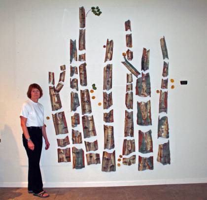
I got a kick out of this note from Gail Frasier today:
“My lesson for today is: Don’t send a picture to a publication that can’t stand alone. Seems logical, doesn’t it? But my logic has tangents. Well, I sent YourHub [a Denver Post regional insert] 3 pictures thinking I might get 3 in (positive thinking, right?) and they published only the 3rd and last one I sent–it makes little sense without the other 2 photos! See my rear end in today’s issue.”
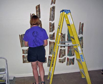
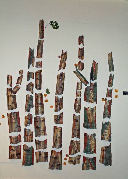
The top two photos are the ones she wanted pictured with the article, but they ended up using only the bottom (no pun intended) photos. I’ll add: Not only that, but it covers up the artwork. Why in the world they chose that one to publish is beyond me! Fortunately, the others are in the online version.
Image: Gail Frasier, Aspen Stand. Ceramic. (c) The Artist.

6 thoughts on “You have no control over what you send to the media.”
because newspapers want action pictures, pictures that tell a story of some kind more than a static, promotional picture of artwork? the bottom picture shows the artist putting up the work, which although the artist may not like it best because it obscures the work, is actually the more interesting picture in terms of news, which is what the paper is about….it shows the artist at work. just guessing but as a writer for newspapers I have a bit of a clue as to how they use photos….hope that helps? if you look at the 3 photos from a pure general interest point of view the third picture invites you to take a closer look to see what is going on which may actually invite a closer look at the art work in the end.
I agree with the above comment. I’ve noticed that newspapers like having an ‘action shot’ of the artist (the artist present doing something). I never really thought about it until reading the above post, but from what I’ve seen and from my own experience, the papers generally like to frame the shot with the work visible and have the artist somewhere to the side in the foreground, writing or looking busy. Either that, or people looking at the work and discussing it with the artist somewhere to the side, indicating that people other than the artist are interested in it. (I’m thinking of Trinidad newspapers, but I guess this may apply to other parts of the artistic globe as well).
A few thoughts about the three photos. First, the photo of just the artwork lacks context…What is it? Where is it? On a postcard? Greeting card? Small canvas? Large canvas? Second photo thoughts…”Ohhhh, it’s big, it’s on a wall. I can tell because of that person there. Who is she? A salesperson? The owner of the wall art? Third photo: “Oh I get it. It’s art. And it really is big art, there’s a ladder there. And that person is obviously the artist, who has been using the ladder in the creation of the art. Cool.” So I can see why they chose the third photo. It tells us most of the story.
Lesson learned: always try to put yourself in the other person’s shoes. What do they see & perceive?!
It would have been great if the ladder wasn’t there!
I agree with everyone’s theory about newspapers liking “action” shots. They never want one of the artist, simply standing beside the artwork – at least that’s my experience. They want the artist to be DOING something. (Thus, if she had pretended to be “making” the artwork, even if it was already completed, they would likely have printed THAT). I sometimes think newspapers ENJOY using a photo that doesn’t necessarily put the featured person in her “best light.” This is certainly not true of all newspapers. Unfortunately, I think this attitude is prevalent in more than I’d care to count.