We started talking about what it means to curate art and then looked at guidelines for you to do the job yourself.
Today I want to give you some ideas to help freshen up your art – not just for others, but for you. You will learn things about your art when you challenge yourself to look at it in new ways.
Because we’re meeting in a virtual space, we’ll look at how this might be done on a website, but everything I share here could be applied to a live venue.
This post is intended to get you thinking. It’s just a brainstorm of ideas to start the process. I’m not saying that the ideas are brilliant or anything that’s for you.
All I’m saying is . . . think about it.
By Example
Karen Meredith, whose question spurred this series, agreed to let me use her site as an example.
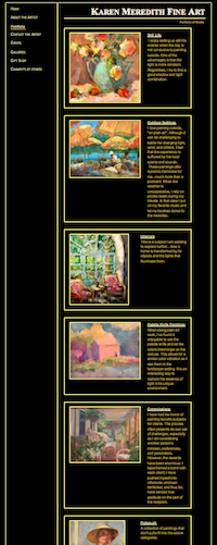
As you can somewhat see in the image on the right, Karen has her paintings broken down into fairly standard and accepted categories: Still Life, Outdoor Settings, and Interiors. Then there are Palette Knife Paintings, Commissions and Potpourri (paintings that don’t fit neatly into any of the other categories).
There’s nothing wrong with this, although I would argue that the last three categories could be squeezed into the other three and be eliminated.
Think Themes
But . . . what if we looked for other themes?
Under the heading Outdoor Settings, Karen has landscapes, houses, umbrellas, boats, gardens, fences and more. There are a number of possible themes.
Houses. No, not just houses . . . “Quaint Cottages” or “Storybook Cottages.”
Gardens. No, that’s not terribly exciting. How about “Garden Entries” or “Garden Arches” or “Entering the Garden”?
In the Still Life category, we find fruits, flowers, and figurines. Hey! “Fruits, Flowers, and Figurines” could be a more interesting name. But it’s still broad.
When I squint my eyes on the page, the palettes emerge and I find myself wanting to see all of the paintings together that have blue backgrounds and pink-to-red flowers.
Then the yellow sunflowers and lemons strike me. Everyone knows that van Gogh’s Sunflowers set an auction record of $39.7 million back in 1987 (adjusted to $74.5 million in today’s market), but not everyone can own van Gogh’s version. How about your own version of sunflowers?
“Sunflowers” should be a theme. Not just because of the van Gogh story, but because they continue to be popular.
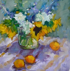
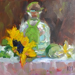
It would be nice to highlight the energy of Karen’s sunflowers in a headline. “Animated Sunflowers” or “Energetic Sunflowers”?? Not quite there, but it’s a start. Here are just three of them. What do you think would be a good headline for this grouping?
 |
 |
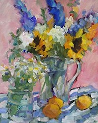 |
| All works ©Karen Meredith. Left to right: Still Life en Plein Air, Tequila Sunrise, Flowers with Apricots. Always consider how they are shown together. The order here isn’t accidental. |
||
This whole sunflower trajectory started with yellow. Color itself could be a theme for any artist, regardless of media or style.
You could have pages, as I’ve seen, for Warm, Cool, and Neutral Palettes or a single color that you favor – like Yves Klein’s blue.
I could go on and on with Karen’s site because there is a lot of variety. I think she was right in feeling the need to tighten up what she shows people.
Remember that your goal with showing your art is never to show everything you have. It’s always to Wow people – IMPACT.
One last thing. Karen has a lot of works on her portfolio pages that are Sold. While I understand that it’s nice to show that you are making sales, it’s confusing for viewers and potential gallerists. I would move Sold works to their own category. This will cut down on a lot of the visual clutter.
4 Steps to Your Remix
- Remove all Sold work or put it its own category.
- Sit with what remains for awhile. And I mean a long while. You can do this in a physical space or by moving your digital images around. I used to do this with 35mm slides and a light tray, but you can do it in an electronic document or app. Just make sure you can move the images to where you want them to be.You want to immerse yourself in your art. Be quiet. Look. Really look. Listen.The work will speak if you give it the opportunity. Ideas will emerge.
- Challenge yourself by putting two works together that you never would have imagine being together. What other pieces can you bring in to make sense of these two works? To create a cohesive narrative about them?
- Have fun with it! Be as creative with your installations (real or virtual) as you are with your art. As I said previously, you’re creating a composition made up of individual works of art rather than your chosen medium.
Does this give you any ideas?
Does it make you think that some of the programs we use to show our art online are limiting? Or perhaps it’s the online space in general that’s so limiting.


36 thoughts on “Remix Images of Your Art for a Fresh Look”
Thanks, Alyson. Lots to think about. Part of this will be easy…like archiving sold works. Putting a creative spin on the others will be challenging but fun and likely be more interesting to the viewer. After all, we are supposed to be in the creative arts!! That aspect should run through everything, non?
This is an excellent post and I don’t do enough of that “sitting quietly” and just observing” the work in the studio. Here is my question for you. What if you are an artist who has 3 different mediums…materials and subject matter. In my case, contemporary abstracts on canvas, landscape painting on canvas and paper and found object assemblage. I feel like I need to let one of these go and focus. This may be a little off topic, but when I think of putting works side by side…you see my dilemma. Thanks. Wayne
Sometimes you need more than 1 website. If you have different audiences for each, as I suspect you do, you might need to separate them.
The media doesn’t matter so much, but if they look like 3 different artists did them, I’d separate them.
Maybe abstracts and assemblages could go together.
Besides my earlier comment above, I do have one question: do you have a sense of how many categories should be offered? By narrowing the art into themes, the number of categories could multiply…or greatly reduce the amount of available inventory shown at a given time. And in this light, do you consider the artist’s website more of an exhibition rather than a “store”? You have gotten us all thinking!!
Karen: As few as possible! 3 or 4 on your main portfolio page.
But you could have categories and subcategories.
So, you could have Sill Lifes and then Sunflowers and other categories within that. So, start broad and keep narrowing.
You never want a page that has too many choices to click on.
Alyson — We have been exploring the same topic on The Art Edge. I view hundreds of artist websites each day — I’m constantly looking for artists to write about. Needless to say, I stumble upon a lot of visually overwhelming artist websites.
Your average website visitor is not going to view page after page of images… so it is important to present the ‘best of the best’. It can be helpful to rotate images as well. Honestly, I think it is best to stick with between 10 and 20 images in each category. Apparently that suggestion is a ‘hot button’ issue with some artists.
One artist told me how he has over 100,000 art images on his website. I don’t know about you… but I’m not going to view 100,000+ images. Ha. I try to discover the real gems — but aside from that, the experience is overwhelming. You don’t have to post images of everything you’ve created.
100,000 is crazy! And not every one of them can be good. Even the best artists produce crap. Artists have got to learn to distinguish among the awesome stuff, the good stuff, and the crap.
Wow!
A fabulous post…and verrrry thought provoking.
I found your response to K W Thornley especially useful as I’m in process of embarking on a whole very different approach.
…and I had to laugh at “Does it make you think that some of the programs we use to show our art online are limiting? ” because it was as if you had read my mind on the spot.
…a lot to think about.
Thanks!
Victoria: I’m glad you found it helpful.
I’ll add that being selective allows the artist to find out which images have the most impact with the majority of viewers (if the artist is able to track viewing data). That is how Banksy got started when he first launched his website — he would show a few images and ‘weed’ out images that received little to no response. He focused on presenting images that received views, comments, etc. — and removed everything else.
Brian: Do you think this is pandering to the market?
This could be an interesting discussion. I’m not convinced it’s wrong because artists want to communicate. It just brings up all kinds of issues.
First of all the paintings by Karen Meredith are just beautiful. Your blog with her paintings is an Epicurean treat to the eye and the mind. In my book “A Strategic Painter” I have discussed this very topic as well. After reading this blog I feel quite happy that I am not the only one who thinks along these lines. It took me years to come to this conclusion myself.
Roopa…I am so flattered! Thank you for your kind words! Karen
Great minds, Roopa!
thank you for reminding me that I wanted to add series categories to my website. Right now I have the landing page with the newest paintings and then paintings grouped by size. I think it would be nice to have a couple of series tabs as well like fog, lost in Shanghai, reflections, etc. When I apply for residencies or propose exhibitions I always create a new folder in Bridge and move painting jpgs around in that environment to create the proposal and see how the paintings are working together. I want to be sure they make sense for the viewer and make sense with what I’m proposing.
Sounds good, Victoria. If possible, think of how you could continually narrow down the options rather than producing too many options on a single page.
Alyson… you continue to keep us on our toes… and to think about what we are doing, as the artist, to support and show our art in the best way possible. Karen’s work is absolutely sumptuous. I agree with Roopa Dudley about them being a “treat to the eye and mind.” I have found that a website is a very challenging way to show art. I have been unhappy so far with my art websites. I am in the process of creating a new website with fewer works shown. This helps me show them at larger sizes on the screen, creating more impact. I’m not trying to squeeze in all my works in tiny thumbnail sizes. No more. I love the idea of curating. That allows me to consider the idea of having my own art exhibition, right there on my website. This will help me bring back, if only temporarily, some of my favorite past works. But, they do not need to stay on my website forever. I love where this thinking is taking me… thank you! Mary
Mary: I’m glad your juices are cooking. Remember that websites aren’t your only options. There are blogs, Pinterest boards, etc.
I love the blogger. It is free and it is better and engaging than a website. I followed Alyson’s advise when I read her book “I’d Rather Be In The Studio” and created a blog with professional photographs of my Artwork (My Visual Diary) and now I am getting attentions of sorts from all the lovely Artistic peeps as well as Art Collectors. Blogging is the best way to go IMHO. http://roopadudley-artblog.blogspot.com/
Roopla… we share the same background color image on Blogger: http://myartnotes.blogspot.com/. I think I agree with you about a blog. It creates a place of communication. I have used blogger for about five years. My websites have changed over those years. And, I wish I had a more integrated approach. I’m still working on that. I’m glad you have found what works for you. I love your blog.
Based on your suggestions, I just checked with FASO, my Website provider, and they don’t offer subcategory features. They will customize for an additional charge of $50/hr and of course they don’t know how long that work would take. Obviously, that would add up if I continued to “recurate”! This just gives me more impetus to get creative!!
Karen: We are always forced to be more creative when we have constraints. I think creativity suffers when the field is wide open. Good on you for not letting it stop you!
This is great food for thought – especially as I am in the process of revising my website. I think it would be fun to group some of my paintings together by palette, or by “linear” and “atmospheric” – but here is my technological question, which you ask us, at the end – it’s not so easy as pulling paintings off the wall and re-arranging them (though that’s not so easy either if you need to spackle and paint patch) – it requires re-building menu categories, etc. I THINK in my new website it is not so much work as the old… but what a lot of work, especially if I have to drag in my husband/webmaster to assist… thoughts??
Do you have a blog, Michelle?
I do have a blog – that I don’t utilize to its fullest potential! Would you suggest creating small image groups in blog entries? Or what was your thought?
Also – in terms of pulling sold work… You really think one should pull it all? Sometimes I have sold most of the stuff in a series and what’s left doesn’t give a full perspective of what the series is about…
Michelle: Yes to the image groups on your blog posts or even blog pages. I’m just saying it doesn’t have to be on a static website.
You can always link to your blog posts from your website, yes?
You don’t have to pull all of the sold work, but it depends on what your goals are. If you’re seeking galleries, definitely remove the sold work from the major groupings. Galleries will become frustrated if they fall in love with something and then realize it’s not available.
This is a great post Alyson- so much to think about. I am going to change the title of one of my portfolios as soon as I finish this message.You have opened the idea of creative categories for me. I especially like arranging by color.Thank you.
Glad it gave you some ideas, Ann. You’re thinking like an entrepreneur now!
Hi Alyson,
This goes on my long to-do list. I love your ideas.
XO Barbara
Barbara: Our lists never seem to get shorter, do they. That’s why I’m writing about Priorities soon.
My art is grouped in collections…The Buildings Collection…The Doors Collection…The Abstract Collection and The Miscellaneous Collection [for the leftovers].
Oddly enough this is what I did earlier this year…just do it you know it makes logical sense in a disorganised world.
I like it, Phil!
I’m with Phil. I like seeing ‘collections’, ‘series’, and so on listed. It is more intriguing than using ‘Oil Paintings’, ‘Sculpture’, and so on as titles. Just my 2 cents. 🙂
I think how you arrange and title works depends on how you expect your audience to arrive at your virtual space. If you are depending on people to stumble upon your website in a search engine, then using simpler and literal titles is better, i.e. “field of yellow sunflowers” would likely get a random passer-by more than “memories of golden fields.” However if you are promoting your website and expect your visitors will be arriving directly, I think there’s more leeway to have creative titles.
I agree there is a lot of works presented and showing less might be better, with an archive to show older works maybe.
I liked Karen’s paintings a lot. This is completely an opinion here and Alyson you might disagree, but I think having very personal descriptions on each art work detracts from the work. I think if an artist has something personal about them that influences their work strongly they should incorporate it into their statement, but not under each painting.
When these descriptions are under each painting I am “robbed” of forming my own impressions, and also some of them are very personal such as the one where Karen says her husband gave her roses for an occasion. What if my husband died and I was grieving and I then remembered how he gave me roses? What if my husband was a lech and I hated him?! lol sorry, that’s extreme.
There is some advice I read in a book on writing music lyrics that goes something like, beware of writing things that your listener might get jealous about. This includes songs about relationships especially is a touchy lyric subject, because people get jealous of relationships and hence you notice a lot of songs about heart break but it is rarer for a song about it working out making it big. Not impossible, but a challenge. The point being, you want to lessen any possibility of alienating a potential buyer. As artists, we do step on toes. /shrug But I do not think Karen’s medium needs to worry about that ingredient.
Dee: I do disagree because I think you’re responding as an artist and not as a potential collector.
I know from experience that stories can help sell a work. They can make a connection with people who don’t have a visual education (about 95-99% of the population, I’m guessing).
Every artist has to do what is comfortable, but as a former museum curator and educator, I want the stories because I know they bring artwork to life that most people would quickly dismiss.
I LOVE to read stories behind the paintings. I agree with Alyson 100%.