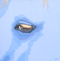
I have been a horse and animal portrait painter for several years and my reputation as a painter has been built on that. I continue to do that and it’s an important part of my income. In the past two years I have starting doing paintings of blue horses which are very graphic and different from my portraits. I want to market the blue horses more to the gallery market but also to my portrait customers … what little I have done, I have gotten a good response from my portrait customers.
The question I have is, can I market both of them together as in an equine magazine and other equine market ads? [See draft of ad in image.] Dollars are scarce and I need to make the best of them especially until the blue horses are much more established, and I don’t want to ignore my portrait business.
This is an interesting dilemma. On the one hand, the work is very different. On the other hand, the patron base might be the same. I certainly understand the scarce funds part.

My gut says to do two different ads, even if they’re smaller ones. Maybe alternating them from issue to issue. I think the thing that concerns me most about the ad format Henry’s working with is that there’s no image of one of his blue horses–just a logo. I believe the paintings are much stronger and would make more of an impact in an ad. However, would they overpower the other work?
I think the simplest ads are the most effective and that Henry is trying to do and say a bit too much in one ad.
What do others think? Can you help out Henry?
Images (c) Henry Patton. Lower image: Eye of the Blue Horse.


10 thoughts on “Can two bodies of work go in one ad?”
I know money is tight, but the only way you will ever know with any certainty is by testing. Run both ads and evaluate your response rates. It could save you money in the long run.
One can feature two works of art in one ad – I can’t tell you the number of promotional gallery cards I have gotten that feature two different artists exhibiting together with totally different styles of work. However, it’s usually done by showing the work and highlighting the differences, rather than spelling it all out for the potential patron. I would showcase the art in the ad with a clear delineation between the two styles of work. I would also have fewer words in the ad. Perhaps a statement and contact information. At this stage, what is more confusing to the user experience is the two different websites sites. Is it necessary to separate the two at this point? I would only list his first site because it is what people know. The best source of business is your existing customer base, right? Until the blue horses series takes off and he can afford to run separate ads, it seems to me that it would make more sense to only focus on one site and use it as a conduit to promote his new work – Again, I don’t think a second site is required to do this. Good Luck!
I would agree that less wording is better. Something I constantly struggle with. Work on writing just the most important point ( singular) about each of your art styles, and go ahead and put them both in the ad. I also agree with Allyson that an actual blue horse image would make a bigger impact than the logo. Good luck!
I also would like to see Henry use the actual work rather than the logo for the Blue Horse art – it is so appealing. And I think it could be done in one ad with his traditional work – but I wouldn’t separate the graphics so distinctly – I’d use his name as the unifier, and the source of contact, and then indicate the two separate styles – Henry Patton – does this AND this. I think it is really a neat alternate path!
Henry, I think all you need is a horse portrait, one of the blue horse paintings, I suggest one of the race, your name and your web address, maybe your physical address line at the bottom like you have it. Your art says enough to attract your niche client. Same goes for your website. And I do not recommend selling Tee shirts and original paintings in the same ad or website. Two different markets, price points, and ways of looking at the work in my opinion.
Nice work Henry. This caught my attention because I too am venturing two (ok multiple)different directions with my my work and am curious how I’ll market it. Ditto some of the above comments: blue image, text. I was sort of considering the name/basic info on top, then splitting vertically with creative works on one side and commissions on the other. I know ad space is valuable and you want to use it the best you can for all areas of your work. Does it matter where you are in your career? Does it depend on which service would you like to market? If you wanted to start spreading the word about the Blue, could you just add a little blib on the bottom about custum portraits? Which do you want to market more? Tracy http://www.tracywall.com
Wow, Henry, you’re receiving some terrific feedback from people. Sounds like everyone wants to see your blue horses. Here’s what I’m wondering . . . What if you distinguished the background more so that it looks like two different ads? Maybe one has a dark background and the other a lighter one?
My advice is to only advertise the portrait art. Why? First, I think you should only use print ads for products that can generate revenue to pay for the ad. Second, while the customers for the two types of work may be the same (horse enthusists), the *markets* are different: People will buy the two products for different reasons, and will therefore respond to marketing in different ways. While print ads may work for one, it doesn’t mean it will work for the other.
Wow! Thank you everyone for you comments. These are very helpful. I am still mulling it over but I think that I will do what lots of people point out, and use both images (a portrait and a blue horse) in one ad with only one web site address and very little type. The other idea I am working on is placing the ad over several months, rotating between blue horses and portraits. You have given me a lot to think about in a short time. Again, thanks to everyone for your comments. And thank you Alyson for all your help.
I agree with those who have said to use both images – I think they can work together (I am also an artist with different directions that I market together.) I agree fewer words and definitely the blue horse painting too. It makes sense to me to mainly market the established site now … and have a prominent link to the blue horse site. Yes to one ad!! Sorry to take so long to post … gotten behind here. ~ Diane Clancy http://www.dianeclancy.com/blog