Since lots of artists ask, I thought you might be interested to know what I look for when I visit an artist’s website.

What I Want to See
I want to see your art! Big and beautiful on every page. Don’t give me thumbnails the size of postage stamps. Knock me over!
I want to see you. I’m probably on your site because I came across you in an email, on Facebook, or online somewhere. I’d like to see a picture of you.
I want to read about you. What do we have in common? Why should I stick around?
I want to choose. Don’t make me sit through a long video or a flash show of your images. Don’t make me guess where I should click to find your art. I want to see what I want to see when I want to see it.
I want it to be easy. I’m busy. We’re all busy. Make it easy for me to browse, to buy, and to contact you.
I want to feel your passion for the work. I want you to inspire me. The reason I studied art history was because the artists’ stories and their connection to the larger world inspired me. Don’t tell me you’re passionate about art. Show me!
Along the same lines, I want to sense your confidence. It’s not too hard to detect a timid artist online. Be bold! Be confident in what you have to share with the world.
What I Don’t Want to See on Your Website
- Crappy images
- Bright colors that compete with the artwork
- Black backgrounds with white text (I may look at images, but I don’t read white text on black backgrounds – too painful on the eyes)
- Excuses or apologies
I have oodles of opinions about artists’ websites. I’ll share as much as I can in the Website Makeover audio program with Patricia Velte. This is a must-listen product if you are re-doing or starting a website.


42 thoughts on “When I Visit Your Website . . .”
You are a demanding art biz coach! I am almost finished reading I’d Rather be in the Studio and it has given me so many ideas. I’d love it if sometimes you could focus on the issues in your chapter on introverts. I understand that it is important to have self-confidence and get over being shy, yet I’d surely love to know HOW to do this. Do you know of any artists who have managed to overcome shyness and low confidence? If so, could you share some stories with us? Thanks so much!
Beth: Yep, demanding. I expect a lot from my artist-clients because I know how much they have to give.
As for introverts, I certainly am not an expert. But I think THE most important thing is baby steps. You have to do something consistently – regardless of how much you might not like the task.
Wonderful very new book named “Quiet” by Susan Keane ( I think) that was just published about introverts, and some good insight on how to overcome it if you need to, or too become at peace with it if you do not.
I am a former shy artist who “socialized” myself enough to make good contact/interaction with clients.
It’s actually Susan Cain and it was published earlier in the year. I haven’t read it, but recommend it often. Also, Google her interview with Daniel Pink for insight. I heard her speak at the World Domination Summit in July. Good stuff for introverts.
I had to laugh. I believe my website meets your standards. (Except for the unfinished sections) As long as grey font on reddish-black (think black velvet cake) background is acceptable to you.
I personally am bored with white backgrounds, lots of small font, widgets, flash, advertisements. Widgets belong on blogs. Advertisements on their own page, flash belongs on gaming sites, and small font belongs in the past.
On the third hand, I’ve never had an actual critique of my website. Which, by the way, I do have an alternate CSS set up for which is accessible via your browser’s Style choice options (or at least Opera has that, I don’t know about any others). This reverses the dark background light font theme.
Sorry, Patricia, but I won’t read the text on your site. Light on dark is hard with astigmatism.
There’s a reason that white/very light is the standard.
Now that’s odd, Alyson. I have very bad astigmatism but my glasses must correct it enough (at least in the right eye) that I can read my site. Or maybe I am used to it? But I find pale on dark to be dramatic and restful at the same time. Wow, who knew even within similar eye problems there’s be such a difference of preferences.
Here’s my problem with white backgrounds: they very often give me a headache. Another thing I hate is very tiny font. Very tiny font is for footnotes and “the small print.”
I do have an alternate pale background with darker font but I don’t know how to make it readily available to someone by just a click of the mouse.
Well, maybe I should reconsider my background – but there’ll always be someone to say it should be something else and I am so confused by contradictory advice.
That’s why I say this is what I want to see. I can’t speak for anyone else.
I think black is far too heavy for art. Again, my opinion.
Yes, well, your opinion counts for a lot with me. For a variety of reasons not the least of which is your experience in the art field.
🙂
Well, I am open minded enough to give it a shot. I’ve changed the alternate order in all but a few of my pages but will not be uploading them until I make a few more changes. I am thinking of going into the guts of my WordPress theme first and making the color changes there tomorrow or Tuesday.
Then I’ll ask for opinions and see what comes up.
Well. I revised my website to be dark font on pale background. Well, most of it, anyway. I think there are a couple jewelry gallery pages I haven’t changed. One professional web designer looked at the original and she liked it. I did too, but if potential clients and collectors won’t stay to read and look I am just killing my career.
So now, it’s (mostly) Alyson readable! I just hope it’s as pretty and exciting as it was before. Now I have to go in and manually recode my blog theme. Ouch. Now that’s not trivial!
Patricia: I think it looks GREAT! I really disliked the black especially on your site. It’s so light and airy now. Good job!
Thank you! I was inspired and I went into my WP theme and changed it to match. I have to say, I was wrong about the dark – it was actually too sedate. Now mu blog POPS!
I formally invite everyone to take a look.
http://vener-art.com/ for the web site, but click on my name for the blog.
Thank you, Alyson! (and I have blog potential from the responses I got from folks in two of my etsy teams).
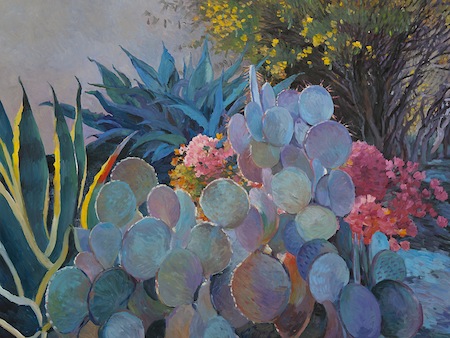
By the way, I love the painting. I think the layout, the colors, and the very odd plant shapes are perfect.
I agree the painting is amazing… it truly moved me
I learned about using a black background years ago when I paid handsomely for my first web site to be built by a web designer… She used the black background & I asked why… She said because it is much harder for someone to print out an artist’s website when the whole background is black- uses up too much ink…
Sari: The background doesn’t print black – at least not in Firefox.
I think things have changed since you were told this.
http://mgaguru.com/background_printing.htm Yes, I guess things have changed… I found this link which explains how to Enable background printing on various browsers… Does that mean if I put images of my paintings as the background fill, that they cannot be printed out? (interesting security idea)…
Update: Am in the process of converting all my various sites & blogs to dark text on light background… Ah, ignorance was bliss… Thanks are in order… Sari
Spot on again. Aesthetically garish websites by artists are disengaging. A website is a canvas. Keep the brush strokes clean, fresh, and vital. Great advice – thanks for the reminder.
I like your blog, ..
very artistic ..
may I learn from you about the art ..?
rgds, santi
Good information Alyson!
I can’t wait to take the class as I am in the process of re doing my site.
Katherine: Glad you can join us. You’ve always had a very nice site. Seems like I’ve been through 2 or 3 versions since you’ve been around – back in the early Art Biz Coach days!
Thank you Allyson. I am in the middle of a redesign- getting my blog and website under one “roof” with Word Press- and I believe I’m on track….
I love finding “you” in my inbox!
Karen: Thanks for letting me into your inbox. I know how precious that space is.
A.L.Y.S.O.N
(I knew that)
Karen: I don’t even notice misspellings any longer. My whole life has been a spelling game.
Great points Alyson, after all they say first impressions are lasting impressions. I still need to fine tune the “about you” which I have been slacking on a bit.
Vanessa: You’ll get there. I think “About” is something that is constantly in progress. After all, we keep growing.
H’m, it’s a fairly easy change from my present dark background style to my alternate pale background style – I only have to change which is called “alternate” in my headers. Maybe I’ll change one (or more) and ask people to choose which set up is most preferred. Something to do in April or May, I guess. I just don’t want my site to look like everyone’s else or anyone’s else or, just as bad, to be boring. And it has to be something I can program relatively quickly myself.
Alyson, I was so excited to clink on the “Facebook” link within this post and see my page pop up! Thank you for that act of kindness. I have learned so much already in your Get Organized Class and am looking forward to learning more in this Website Makeover Class. I do love my black background contrasting with the bright colors of my artwork, but I am willing to change and GROW!
An artist should make the effort to check out say three other artists’ websites on a daily basis AND leave a feed-back comment. Then look at their own website just to prove it has the perfection that is in keeping with their art and the image they wish to show the entire world 24/7. We do not, as artists’ collectively, leave comments or get comments on our art or our websites. It is only the modern conversation that needs to be cultivated, just make the time, just make the effort.
Pingback: tortagialla.com – Artist and Designer Linda Tieu
Ok, I agree with you on your website points, and know I have a little work to do on mine. (Actually just realized I lost some links, too!)
But here’s my question….
I understand having larger bold images on home page, but how economical (in use of space) is it on each of 3 “gallery” pages (like “figures”, “landscapes”, etc…) where the full portfolio can be seen. If one uses large images on these, don’t you limit drastically the number of images you may use per page without asking the viewer to scroll? Perhaps this is just a trade off: 6 of one, half dozen of another. Interested (as always) in your thoughts.
Thanks for all you do!!!
Tracy: I don’t think it’s a bad thing to scroll any longer. It used to be important to get it “above the fold,” but I don’t think that holds water anymore.
BUT, you do want to make it known that there’s good stuff below the fold.
On the gallery pages, big splashy images aren’t as vital. But good-sized thumbnails are vital. I’m thinking 150-200px wide. Doable?
I think you’re right!
As time marches on, requirements of sites will change too.
Thanks Alyson!
Pingback: Artist Websites: Appealing to the Slow Scavenger vs Fast Hunter Shoppers — Art Biz Blog
A bit belated here, but I wanted to say thank you for pointing out the dark background/light text problem and encouraging people not to do that on their sites. I get migraines and have other visual problems. White text on a black background is painful–quite literally–to read…if I can even focus my eyes on it at all. I’ve come to quite a few sites and blogs over the years that I very much wanted to read, but I could not even look at them. It’s annoying and frustrating.
Alyson, I just read this article and did not know this about the black backgrounds. I guess I thought the black background showcased the art better. I am ready to change to something different.
Since I have my site through FASO though, I need to choose between the options available. Also, I would love to get your opinion on the content of my site though as I’m always looking to improve.
Thank you for your wise insights.
Marie: “Black makes your art POP” is a common misconception. It’s just WAY too heavy for every piece of art I’ve ever seen on it.
There’s a reason that dark on light is the standard. Readability.
Try off-white or light gray. My choice will always be white.
I need to sort out the selling side. I have paypal but because the pages were cluttered with buy now buttons, I dumped using it. I was wondering if I should sell on etsy and leave my site sale free. I think I know of someone who does this. Please anyone, I need opinions on this!
At first, I was putting my art on my blog. Then, I had a “wonderful” idea to promote other people and artists around this town, and also venues for art, etc. (But you know what, I never got a “Thank you” for it) and now I decided to make DIFFERENT blogs for subjects. For instance, I made a blog for promoting arts around the area, and another blog for something else, and then my MAIN blog is promoting my own art now! And maybe a few mentions of my personal life, but again, that is going to another blog, NOT my art blog. I read Alyson’s posts and it gives me ideas, I highly recommend https://aaartbizold.wpengine.com ! 🙂